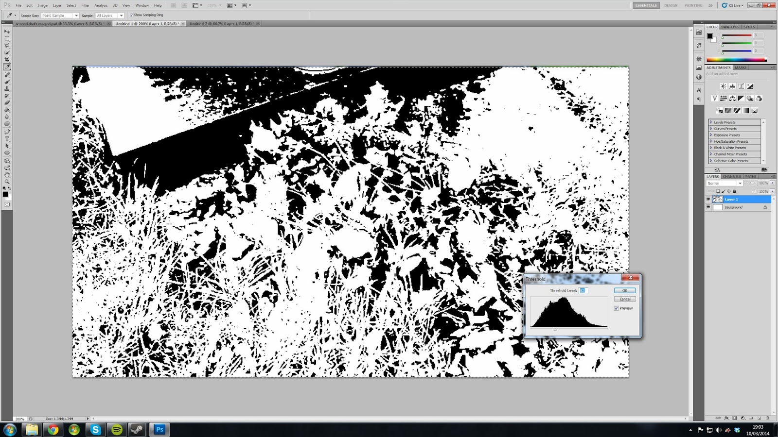
 For my second draft I have made some alterations to the imagery. For the main image of Leah and Jordan I used the quick selection tool to cut out the area surrounding them and placed them on top of a rose backdrop to reinforce the romantic mood to the image. In order to show that the advertisement is for an alternative genre and to make it cohesive with the CD cover, I used the 'angled strokes' filter which makes the image look similar to an illustrated, cartoon style.
 I also used a different image for the background behind
the text. This is because after a re-shoot I had to use a different closing
shot as to which I did before in the graveyard scene, in order to make it
cohesive with the music video I used an image of the most recent closing shot
in the second draft. I think this image is just as effective as the rose since
it allows the text to be more visible. I made the image to be of a similar
style to the rest of the imagery by adjusting the threshold which gives it a
black and white appearance. This is the same technique which I used for the
first draft of my CD cover, therefore allows the magazine advertisement to
connect with the CD cover.
 Furthermore, I made some adjustments to the text. I changed the font style of the smaller text which isn't as important as the bigger text. I also changed the colour of the text so the main colour was black, but the red stroke allows the text to work as part of the overall house style.

No comments:
Post a Comment